This is my learning log for the OCA Ditigal Photographic Practice course

Monday, 28 October 2013

Project: Black and white


Exercise: Colours into tones 2

DSC_2509_edit01_web
For this exercise I have chosen a landscape to enhance the aerial perspective. This is the original image.


image
Here is the default black and white conversion in Silver FX Pro.


image
Here is the enhanced version in which I have increased the contrast slightly by applying a 76% filter strength to the red channel (18 degrees on the colour wheel) which has darkened the blue of the sea.


DSC_2799_edit 02
I thought I would repeat the exercise with this more dramatic image from my archive.


image
Default conversion in Silver FX Pro


image
By applying a 100% filter to the yellow hues, the contrast of the sunlight area in the centre has been increased and the plants in the foreground have been made lighter, making them more prominent.


Conclusion: This was a useful exercise in learning how to adjust the different channels and to see what effects can be achieved.

Sunday, 27 October 2013

Project: Black and white


Exercise: Colours into tones 1

DSC_9594_web
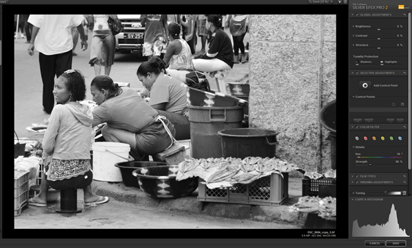
Following the notes in the course folder, I used Silver FX Pro to process this image (RAW files are processed and saved as TIFFs in this application) of fish sellers in Mindelo, Sao Vicente CV:


image
This is the default generated by the Black and White conversion option on the filter menu, showing the default settings in this screen shot with no colour filter applied.


image
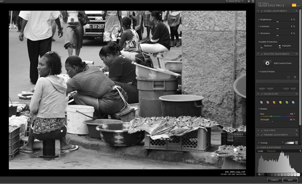
Concentrating on the the lady with the red t shirt and the green bowls behind her, this is the first adjustment; lighten the red: Hue 16 degrees, strength 60%. The red t shirt is lighter and the green bowl is darker.


image
Reversing the adjustment lighten the green; Hue 109 degrees, filter strength 68%. This has darkened the red considerably.

Conclusion: The three images above have a fairly even distribution of tones but because of the effect on the skin tones, the effect of lifting the red has a more pleasing effect and makes the image tones appear to be better balanced i.e. less dark tones overall.

Project: Black and white


Exercise Strength of Interpretation
The objective of this exercise is to process two images into black and white and demonstrate that the processing applied to colour images will be less marked than the effects on the black and white images.  Here is the first which I think is more suited to a low key black and white image:

DSC_2002_mono_HK DSC_2002_mono_LK

High key

Low key
DSC_2002_HK DSC_2002_LK

DSC_2002_web Processing: Both the black and white and the colour images received the same processing. The original image (left) is as it came from the camera and was processed from RAW.

High key  Brightness: + 63%
Contrast: – 25%

Low keyBrightness: - 8%
Contrast: + 8%

As mentioned in the notes, the effect is more marked in the black and white images although the high key colour image is more contrasty that the black and white high key image.

My second image I think is more suitable for a high key black and white image:
First of all, the original:
DSC_1982_web

DSC_1982_HKmono_web DSC_1982_LowKey_web
DSC_1982_HK_colour_web DSC_1982_LK_colour_web

These are the values used for the high and low key images, both colour and black and white.

High Key: Brightness: +39%
Contrast: + 45%

Low Key:Brightness: –14%
Contrast: – 35%
In addition to this adjustment, the low key image was improved by the use of a red filter adjustment which darkened the green tones on the mountain side:
Colour: 0°
Strength: 66%
 
Conclusion: This exercise clearly demonstrates the importance of being able to see colours as tones in black and white and how extremes of tone can be used to create interesting effects in high and low key images.

Thursday, 24 October 2013

OCA Thames Valley Study Group Meeting 19 Oct 2013


Today was another successful meeting of the group. As usual, students showed work before lunch and there was a discussion about portraiture after lunch.
The first to show work was John. He explained that his was a different idea that he was still working on – he wanted our reactions.
His images were single blocks of colour with a written description of an image (his words) with a caption of the image as it was published. John read his description, and then handed out the prints for us to look at and to read the original caption.
After completing all of the readings, John showed us the book of war images from which he had taken his descriptions.
I think John had printed the block of colour that was brought to mind by his description but apart from the first one he read which matched the predominant colour of the print (orange soil) I didn’t relate the colour to the description. John’s reading in a flat monotonous matter of fact tone and the manner in which he cast the prints onto the table after reading each one, to me reflected compassion fatigue. Having discussed this in relation to documentary photography at the last meeting, I think this may have been his intention. The images he chose were horrific and I thought this was an interesting way of presenting a project and look forward to seeing how it develops.
Eddy is working on Gesture and Meaning and he showed 22 prints that he had taken for an exercise in which he had to go to a place he didn’t know and take a series of linked pictures on a walk through the place. He had chosen Hungerford and we saw images of buildings and streets in the town but not much evidence of links between them. Mention was made of the shootings but Eddy said he was not prepared to do anything that sensitive or controversial. Sharon suggested some edits that he could use, e.g including only those images which contained part of the road or that which did not. There were some with direct references to the Hungerford’s past, the Bear Inn and a courtyard which was part of the stabling for the teams of coach horses that used the London Road in the 18th century (A4). Perhaps he could have made more use of signs and fingerposts to link the various areas of  the town. Again, it will be interesting to see he concludes this exercise.
Steven presented an edited version of his stained glass windows project for the colour assignment of TAoP. He had learned about personal iconography since the last meeting and had produced some printed cards explaining his personal connections with the images. Further suggestions on how to present the images with the supporting text were discussed. Ideas included using a post card format with the image one side and a hand written explanation on the other.
Steven also showed the images for the start of the Light assignment. He had made a wooden cross and a barbed wire crown and was experimenting with the different lighting effects required for the assignment. His compound image of his cross against the background of the Coliseum in Rome was interesting.
I presented my idea for the third assignment of DPP which needs to be in black and white. In August I had a Scot’s Pine tree removed from my garden and thought that as a memorial to the tree (which must have been over 100 years old) I would record and present the photos in black and white for the assignment. I had made seven prints containing nine images (two diptychs were made containing related images) The sequence started the day before the work was carried out and I photographed the tree in situ and showing its location. The following day was wet but I documented the tree surgeons work and made more images of the pieces of the 80 foot tree as they were stacked in the garden.
The idea seemed to go down well and I received some good suggestions about presenting the assignment and which images should be included and /or left out. I will also try to print the assignment myself as the lab prints did not have the required quality to do justice to the photographs.
I have to finish the final three exercises and I will then re-edit the assignment images bearing in mind the comments from the group.
Catherine showed a print on Titanium paper and Sharon updated us on her current Wish Prayers project.
Group discussion: Looking at Portraits from Photography – Key concepts
Sharon started the discussion by asking the question; do we see the real person in the image? The discussion continued with the idea that we are aware of how important it is to us how we look to our friends and family especially at formal social events. Is that really us or do we present a version of ourselves as we would wish to be seen? Also, how do our prejudices, stereotypes and history colour our perceptions of the portraits that we see?
Sharon presented three portraits and told us the one of these three was a philanthropist, another a criminal and the third would become famous. We were asked to write down some key words which came to mind for each of the portraits with a view to deciding which was which.
  • Older man; benign, confident, characterful countenance; avuncular
  • Young woman; confident air, attractive, unrepentant, disbelief
  • Young man; shy, disturbed
Having thought about the portraits, we were told that there was no correct answer and these were random characterisations. The point was that we looked for these particular characteristics, re-enforcing our own prejudices and perceived stereotypes. 
The next exercise was to make three portraits of one of the group, Dave volunteered and was photographed as he was, a lie (something he evidently wasn’t) and as he wanted to be portrayed. The photos were taken with Sharon’s camera and I’m not sure if we will have access to copies but in case we don’t, we took a picture of Dave as he appeared to us, good humoured, genial and smiling, another of him looking aggressive and another of him peering through foliage (he is a keen birdwatcher). This exercise raised the question; can the sitter influence the photographer or even control the photographer? The discussion continued on this theme until the end of the session.
The text for this discussion was the chapter “4 Looking at Portraits” from Photography – Key Concepts.
Friday, 18 October 2013

Reading: Art Photography Now – Susan Bright


Containing examples of the work of eighty contemporary photographer/artists, I am finding this a valuable reminder and reference book in my struggle to understand photography as art. A lot of what is shown and discussed I can relate to and hopefully will enable me to form my own ideas for study projects. Some is not so clear and I struggle to understand what the artist is saying, despite quotations from the artist and explanations from the editor. This may come as I re-read and study the work but some will fall on stony ground.
All of the usual suspects are included, Parr, Sherman, Wearing, Crewdson, Wall. There were some that I had not come across before and that resonated with me and some of the things I have tried. Beat Streuli for example takes candid images on the street of self absorbed people going about their daily lives in situations that we are all familiar with. There may be more to his work that this but I have tried this in my own street photography project in various locations in the UK: http://www.orchardwind.talktalk.net/street.htm which is on-going. My web gallery shows just a few examples.

DSC_0333_2

Although primarily a sculptor Richard Wentworth’s photography interested me. He has taken images of found objects for a series “Making do and getting by” where everyday objects apparently at the end of their usefulness are left in places or in positions that make them appear quirky and/or give a hint as to why they are discarded. These are found in the city. I have modified this idea and have taken photographs of discarded objects in the countryside. This week I came across this wrought iron bed head that was re-emerging on a footpath having at sometime been discarded and buried in the undergrowth.
 
DSC_4421_web

The abandoned sofa is also a popular subject at the roadside. While in Plymouth earlier this year I spotted this one at the waterside and photographed it as a tribute to Wentworth. The juxtaposition here grabbed my attention. (I have also nearly finished Geoff Dyer’s “The Ongoing Moment”. My review of that will be written shortly)

DSC_2047

Art Photography Now has put contemporary art photography into some sort of context for me. It is making me consider projects in different ways and in different genres. (The book is divided into seven genres;  Portrait, Landscape, Narrative, Object, Fashion, Document and City although there there are some overlaps -  work that will fit into more than one genre.
There is till a lot about art that I do not understand but I’m slowly getting there.

Thursday, 17 October 2013

Project: Black and white


Exercise: Black and white
Earlier this week I was out walking and photographing on one of my favourite routes, looking at ideas for potential black and white images. My route took me past MOD training grounds and I was not disappointed when I came across an abandoned armoured personnel carrier used for rough terrain vehicle recovery exercises.
I photographed it from every angle, inside and out. Here is the colour image of the interior:

image

I was interested in the graphic quality of the shapes and the contrast of the tones within the image. I anticipated that the black and white version would look more interesting without the distractions of colour.
image

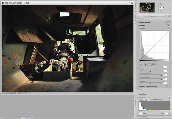
Here is the Silver FX2 Pro screen where the image was converted. I tried several of the pre-set categories and thought that this Full dynamic (harsh) worked the best for the subject. Basically the contrast has been increased to 34% and the highlight and shadow protection sliders have been moved along their scales by approx. one third. There are no colour filters applied. Prior to processing I had reset the levels in Capture NX2 to make an acceptable colour image.
Here is the saved image with the original exposure details:
4440: 1/100s f5 18mm ISO 800

DSC_4440_1

I think this image is perfectly suited to black and white and works well with all of the subtle tones exposed.

Wednesday, 16 October 2013

Project: Creative interpretation


Exercise: Interpretive processing

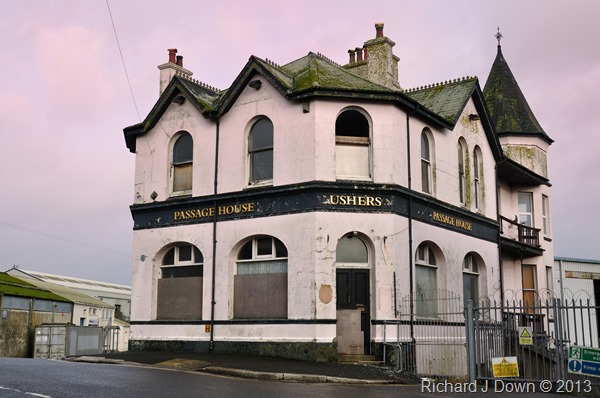
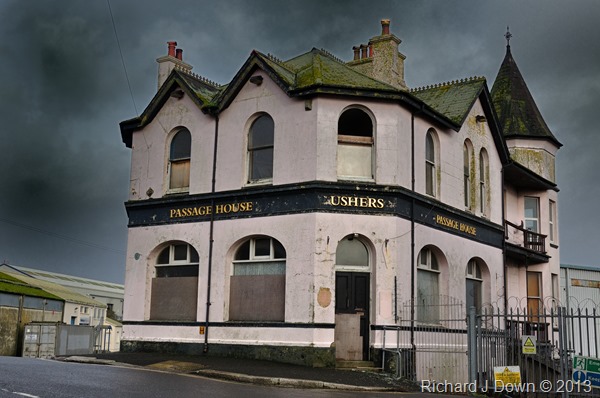
I’ve created three versions of this derelict public house in Plymouth:

DSC_2035_BW_grain


I wanted to emphasise the “grimy” feel of this location. I converted the image to black and white and added a lot of grain. I think this works very well. This effect was achieved using Silver FX Pro2 as an add in to Capture NX2.


DSC_2035_pink sky


My second interpretation included a pink sky – sunset or sunrise. This works well because the pub was originally very pale pink and it looks as if the walls are reflecting the pink light from the sky. The effects for this image and the subsequent image were achieved using three or four colour control points to modify the colour and/or brightness and contrast of certain areas of the sky.


DSC_2035_stormy_sky


I’ve changed the contrast and brightness of the sky for this version for a “Gothic” horror effect. It might be a bit exaggerated but I like it.


Friday, 11 October 2013

Project: Optimising tone and colour


Exercise: Managing tone
I chose to process this contra jour image:
Before processing:

image
After processing: I decided that the contrast didn’t need adjusting. The black point, white point and midtone adjustment seems to have taken care of the contrast as well.

image

RAW processing: Altering the exposure had little effect on this image’s black point so I moved the slider to achieve the correction. Again the contrast didn’t need adjusting.

image

Exercise: Managing colour
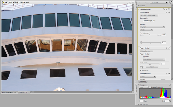
This is an interesting image, the white balance was set on direct sunlight so the shade areas have blue cast as expected. However, the reflection of the sunlit deck in the centre windows has the expected colours.
JPG processing: I usually shoot in raw so I don’t often use this control but I have experimented with it. The black and white point droppers made no difference as there are correctly set with only small areas of the image clipped. First of all I tried the neutral point eye dropper and while this reduced the blue cast a bit it was not sufficiently noticeable.

image

I then tried adjusting the blue channel but the sunlit area became to yellow as I reduced the blue. I then started to play with the Contrast:colour range tool and reduced the colour cast even more.

image

However this was a bit fiddly and compared with using RAW and just re-setting the white balance it took much longer to come up with a satisfactory result. Using the RAW image gave this result by changing the white balance setting and making the image cooler (from 8000K to 7250K)

image

Following this, I was able to make a local adjustment using a colour control point to reduce the warmth of the sunlit area (-38 on a scale of –100 to +100) I deliberately left some warmth there, reducing the warmth excessively made the image appear odd.

image

Finally, I adjusted the brightness and contrast:

image


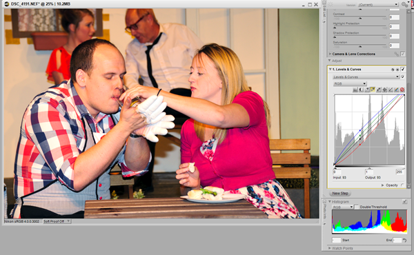
My second image has a different problem. It was taken under theatrical lighting with the white balance set to Auto. However the lights had strong amber gels giving a distinct yellow cast. I carried out all edits on the RAW file this time:

image

I set the white and black points using the relevant eye dropper tools and the mid tones with this result:

image

I dialled back the blue channel just an touch and reduced the brightness.

image

Summary This has been a useful exercise because I have not used the levels and curves tools very much in this application (Capture NX2). I will continue to practice these adjustments when they are required.