This is my learning log for the OCA Ditigal Photographic Practice course

Saturday, 25 January 2014

Part five–The final image


Project: Finishing

My back-up regime is as follows:
Download image files from my camera’s SD card to an external hard disk drive. My transfer software automatically backs up the files to my “C” drive. All editing is done with the files on the external drive and when the editing and processing is completed, the resulting folders are burned to DVD.
My printing processes have been detailed in previous posts. I am using a basic four colour ink jet printer and the proofing software provided in the Capture NX2/ View NX editing suite.
http://rjdown-dpp-assignments.blogspot.co.uk/2013/11/assignment-three-monochrome.html
I find that this provides adequate prints at A4 size.
Sharpening This is something I do very little of, if at all. Sharpening for print is not something I have considered seriously. This exercise will be interesting.
Exercise: Sharpening for print
This is the image that I chose to sharpen and print. The only adjustments I have made are; resize for print, crop and white balance.

DSC_4148_crop
Most of my techniques for post processing come from the book Capture NX2 – industrial strength production techniques by Ben Long. I have learned about the Unsharp mask tool  and the following is a description of the process:
The need for sharpening comes about mainly because the High Pass Filter which sits in front of the sensor applies a very slight blurring to the image (necessary for colour calculations) although a lens that does not produce a particularly sharp image when focussed can also be corrected. The principal behind sharpening is to increase the apparent sharpness of the image by making the edges in the image appear more acute. (an edge being a sudden change of contrast made up mostly of light and dark lines). The unsharp mask identifies these lines and increase the lightness and darkness along these lines making the image more contrasty. There are three controls associated with the unsharp mask:
  • Intensity % (the degree of contrast)
  • Radius % (how many pixels of ‘halo’ are created)
  • Threshold (controls how much contrast change is needed before the filter registers an edge  - by pixel brightness value 0-255)
Experimenting with the sliders determined that the ideal radius for this image was no more than 10% and the threshold was left at zero. I produced four different versions of the image as well as the unsharpened one, changing the intensity from zero to 10, 25, 35 and 50%.
Looking carefully at the prints with a magnifier, I found little appreciable difference until the 50% intensity setting. At 0% the skin of the Julie’s face was smooth but the eye detail was less defined. At 35% the eye detail and the skin texture was acceptable so it looks as if this is the ideal setting for this particular image.
Other features of the image the details of the necklace and the fibres in the scarf became more detailed and defined at 50%.
On the monitor, the differences were easier to see. I have added some cropped screen shots below. What is apparent from the screen and not from the print is the ‘halo’ effect. A balance needs to struck between the different areas of the print and it may be that selective sharpening may be required, in this example, on just the eyes, leaving the skin texture smooth


image image
0% intensity
50% intensity
   
image image


Conclusion: It appears that sharpening has a very subtle effect and may be used to give definition to the most important areas of the image. As illustrated above, selective sharpening could be used to improve just one area of the image. This is a very important tool and each image must be assessed carefully to decide on how much and to which areas of the image needs to be processed to produce a satisfactory print.

Friday, 24 January 2014

Wendy McMurdo - In a shaded place, the digital and the uncanny


In response to my tutors suggestion, I looked at the work of this artist and in particular this series as I recalled seeing one of the images “Helen backstage, Merlin Theatre (the glance) 1996” in Charlotte Cotton’s book recently. While looking at the series, which depicts young people, mostly children, with a doppelganger or even multiple selves in one frame, I also read Gilda Williams essay ‘Identity Twins – the work of Wendy McMurdo’  in which goes she gives one explanation of what this work is about.
The Title above was taken from McMurdo’s website.  the link to Gilda Williams essay can also be found there: http://www.wendymcmurdo.com/
Gilda Williams’ essay is of course her own interpretation of the series (some images of which do not appear on the website) Broadly speaking I can understand her interpretation and it has brought me another perspective on the work. I can also see my tutor’s point about how digital manipulation does not have to be as obvious and literal as the example I chose for assignment 4. http://rjdown-dpp-assignments.blogspot.co.uk/2014/01/assignment-4-reflection-on-tutor.html
In summary, the essay explains that the doppelganger is a mythical monster from German folklore who stalks the innocent from the shadows, eventually replacing them, un-noticed by their family or friends.
Williams then goes on to explain the uncanny (uncomfortably strange – arousing suspicion) in relation to the Doppelganger, in terms of Freud’s renowned essay in which determines the uncanny as:
  • being confronted by a being which we cannot be sure is alive or inanimate, mechanical or living
  • fear of losing  our sight or being unable to believe our eyes
  • fear of having to confront our own double (and thus ourselves)
She also cites two examples in early film and literature “The Student of Prague” and Calvino’s “if on a winter’s night a traveller..” in which the protagonists eventually destroy their twin or multiple counterparts and thus themselves. McMurdo’s work is not this dark however. Perhaps it is for good reason that she chooses children with their associated innocence, for her work. In the image in question “Helen backstage, Merlin Theatre (the glance) 1996” the girl seems hesitant but not afraid. Williams suggests that this image represents an initial self awareness and the subsequent image of the same child “Helen Sheffield 1996” she appears to be at ease with her twin although the game they are playing seems to represent a struggle for dominance.

Thursday, 23 January 2014

OCA Thames Valley Group Meeting 18th January 2014


We were just a small group this time, me, Eddy, Carol, Alet and Martin. There was no tutor in attendance either so we were self directed although Eddy had told us that the afternoon’s discussion would be about Portraiture.
Eddy showed some work from his Gesture and Meaning course. He explained that his images were illustrating the styles of Constructivism, Conceptualism and Surrealism. I was only really interested in what he had to say about the course as the concepts he was describing are a bit beyond me at the moment. Although I will take advice, I think for level 2, I will stick with my first choices of Landscape and Documentary.
Both Alet and Martin were newcomers to the group and showed work from their Art of Photography course. The discussion that followed helped them with the direction that their work should follow, based on the experience of those of us who had successfully completed the course.
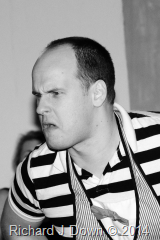
Last year I had tried an exercise photographing actors expressions on stage during a rehearsal for the farce “Trivial Pursuits”. I took 12 prints (3 of 4 different characters) In the hope that it would provoke a discussion about how successful I had been in capturing a range of expressions. (It was one idea for the final project of DPP)
Although the actors were aware of my presence, I was shooting randomly throughout the performance, trying to capture the fleeting moments of emotion. Lighting was difficult and depended the actors position on the set. I suppose it was inevitable that the discussion centred around which set of photographs worked best. Here is the set with the favourite presented at the bottom of the table:
DSC_4188 DSC_4106 DSC_4202
DSC_4089 DSC_4120 DSC_4117
DSC_4125 DSC_4085 DSC_4155
DSC_4050 DSC_4197 DSC_4145

The consensus was that the final set had better depth and worked together better. This is because this character spent a lot of time sitting on a bench at the front of the stage which made him an easier target. Despite the fact that I decided not to pursue this as a project for DPP, It was a useful exercise and I now have some people who are quite relaxed around me and could possibly help with future projects.
Afternoon discussion
I’m not quite sure why we were discussing portraiture again but the discussion took a similar course as last time with the questions of whether or not a portrait needed a person in the frame or was a collection of their possessions all that was needed to identify them. Eddy cited his auntie for whom certain items (I think knitting, a Tesco’s carrier bag and a bag of sweets or a type of biscuit) would all that would be required to identify her amongst family members.
We discussed personas and whether it was possible to find the hidden “person within” in a portrait. I concluded that it takes a fair amount of skill for a photographer to be able to do this and even then, the perception of the viewer may not allow it to come through. We discussed several examples from the recent Taylor Wessing visit but with such a complex and ethereal notion, we reached no firm conclusion.
Extending the idea of the inclusion of a figure in a portrait, the OCA Students Facebook group had posed the question earlier in the week and put up this link to provoke further discussion:
http://www.arno-rafael-minkkinen.com/ I found this artist very interesting indeed. I will write a separate post very soon.

Monday, 20 January 2014

Arno Rafael Minkkinen–Performance Artist and Photographer


This artist came to my attention via a random link on the OCA Photography Students Facebook page.Somebody had asked the question ‘does a portrait need to show a face’ and as Minkkinen’s self portraits very rarely show his face (every other part of his naked body feature in his work) his work was put forward as an example to add to the debate.
I looked at the 40 years of self portraits on his website and and was impressed by the sheer ingenuity of his work, the difficulties he has overcome, the danger he has put himself into and the simplicity of his ideas. Put simply, he inserts himself into the landscape, contorting his body into lines that follow its contours, burying himself in snow, submerging himself in water and all the while using the camera single handed with no assistant. There is no layering of negatives, double exposure, Photoshop or fakery involved.
How he made this work is here: http://www.arno-rafael-minkkinen.com/intro.html.
Minkkinen is also known for the Helsinki Bus Station Theory an explanation of which can be found in this article here:
I’ve summarised it for myself in the hope that I will find my ‘voice’ eventually. “Be true to yourself, make the work that inspires you and when you think it is becoming derivative, don’t go back to the bus station and start your journey again stay on the f’king bus!”
I hope this holds true. Learning about Art is a journey, what we pick up along the way helps our work to grow, mature and eventually enables us to create something that is unique…..

Friday, 10 January 2014

Reading–The Photograph as Contemporary Art - Charlotte Cotton


This one of  the course books for level one. I have now finished it after two attempts. Although informative and a  good overview of the work of a number of contemporary photographers, I did struggle with some of the ideas discussed and some of the language used to express them. Even at the beginning of the fourth year of my studies, I still feel like an outsider, looking in on a world that I don’t understand and frankly leaves me bewildered most of the time. With the work of over 200 artists and only a brief description of just one or two of their images, (reproduced at small scale) I don’t expect to do more than be able to appreciate the diversity of current practice.  Susan Bright’s Art Photography Now (see link below) has done a much better job with a smaller number of artists and a more comprehensive view of their work.
The book divides current art photography into eight broad sections. From each section I have briefly summarised the theme and chosen an image to which I can relate.
 
Ch. 1 If This Is Art: Dealing with subjects/scenarios which the artist/photographer has directed or deliberately planned.
 
pp. 20, 46 Philip-Lorca de Corcia “Head” series resonated with me. http://www.moma.org/learn/moma_learning/philip-lorca-dicorcia-head-10-2002 (I enjoy street photography and have an ongoing project which I call “shooting from the navel” [refers to the camera position] in which my subjects are not aware of having their photograph taken) de Corcia has taken the genre to a new level by using lighting and a long lens to photograph his subjects candidly and selectively. My project is more random with a wide angle lens and a scattergun approach which involves a fair amount of editing. See also my post in reference to Beat Streuli: http://rjdown-dpp-log.blogspot.co.uk/2013/10/reading-art-photography-now-susan-bright.html

Ch.2 Once Upon a Time: Story telling using a single image either by reference to fable myth or legend with which we are all familiar or by a set up that asks us to look carefully and interpret the image using our own knowledge, experience and intuition.
 
pp. 78-79 Hannah Collins “In the course of time 6” (Factory Krakow).1996 http://www.hannahcollins.net/projects/archive/in-the-course-of-time.html  This was exhibited as a massive print (2mx5m) shows a familiar (to me anyway) corner of what could be any workshop tucked away in backstreet factories of post industrial Europe of the 1980-90s. At first I thought it was abandoned but the forge has a fire alight (it’s right on the junction of the two page spread) so it is a working space. Where are the workers? Is there a strike meeting or just a tea break? When they return, what happens here, what is made or repaired? The drum in the corner bears the Polish word for Oil. There is a sense of anticipation and also desolation. The broken window panes, the clothes lockers with their doors hanging open. There is a sense of the past and perhaps the end of something.

Ch.3 Deadpan:  Cotton claims that the deadpan aesthetic is the predominant style of photography created for galleries in the past decade. As I understand the term it is photography showing no emotional or personal involvement of the photographer but has a sense of the beautiful with clarity, detail and often reproduced at a large scale.

p. 87 Ed Burtynsky Oil fields #13, Taft California 2002. I have chosen this as an example because it is one I have seen on a gallery wall at an OCA study visit in 2012 and experienced its scale and detail.  http://rjdown-taop-log.blogspot.co.uk/2012/05/oca-study-visit-260512-burtynskys-oil.html  Included in this post is some discussion about the merging of documentary and art photography and possible conflicts that arise. If this is the deadpan aesthetic then the photographer is presenting his subject matter in an objective way. He is leaving it up to the viewer to interpret the truth of the image and raise questions about what is depicted.

Ch.4 Something and Nothing: Everyday objects photographed in an interesting or unusual way which brings them to our attention. This is a genre which interests me. The final project that I have in mind for this course will be a series of images taken from unusual viewpoints with a macro lens to emphasize objects and surfaces we touch daily but may not register or recognise.
 
p. 117 Gabriel Orozco Breath on Piano 1993 http://www.telegraph.co.uk/culture/art/art-news/8231429/Gabriel-Orozcos-art-in-pictures.html?image=3 This picture caught my attention because of its simplicity. I recently caught an exhibition of UCA BA students work in Farnham entitled “What we leave behind” .https://www.facebook.com/wwlb.exhibition  I have thought about how time robs us of immortality. If we are lucky enough to have a headstone, several generations of our family  remember us. If we achieve fame or notoriety, history may record our passing, otherwise our existence dies with the last person who knew us. For me this image represents  the briefest and most transient trace of our passing….one breath.
 
Ch. 5 Intimate Life: This is the aspect of contemporary art photography that I have the most difficulty with. In her introduction to this chapter, Cotton writes three pages on Nan Goldin. I’ve read through it twice at least. She had a hard life it seems and if this is her way of dealing with it and expressing herself, that's fine. I find it difficult to be interested in it beyond it being a single aspect of a diverse range of self expression currently practiced. Maybe it’s a cultural thing, I tend to find the American capacity for self analysis and angst tedious. One artist’s work that I did find interesting was Richard Billingham’s Ray’s a Laugh:
 
p. 150 Untitled. More of this series can be seen here:
It was Billingham’s motivation for taking these photographs that interested me. Cotton talks a lot about the way artists using this genre make use of  the vernacular style of the family snapshot, the harsh flash lighting and the imperfection of the machine print. Billingham was to use these images as studies for paintings of his family life. In that way they are unselfconscious and not at all pretentious. Individually the photographs could be dismissed but as a series they show an intimacy that could only come from an insider.
 
Ch. 6 Moments in History: The introduction to this chapter asks a question. How do art photographers respond to the decline of documentary and reportage photography, its replacement by TV and digital media and maintain its social relevance? It seems that the approach is different to traditional methods with artists staying out of the action (reported by the mainstream digital media in all its forms) and using a reflective and contemplative approach on the long term effects of the event. Using medium and large format equipment ensures that the physical qualities of the resulting images can be fully exploited in the gallery.
From the examples shown in this chapter it is not surprising that I was immediately attracted to the work of Allan Sekula

p. 180 Conclusion of Search for the Disabled and Drifting Sailboat ‘Happy Ending’ 1993-2000 from his series Fish Story. The three images document the sighting and rescue of the crew. I was fortunate enough to find a .pdf of the book on-line. Although I have only skimmed through it, the images and texts promise an interesting exploration of the  ports, people, politics and the current state of global trade by sea.
 
Ch. 7 Revived and Remade: I can’t pretend to claim that I understood much of the introduction to this chapter but I may be able to summarise: Modernist photography was elitist and in the post-modern era you can do what you like. I’m sure one day all this will become clear but I’ll need help, time and a lot more discussion with my fellow students before it sinks in.
 
p. 196 Self Portrait as my Father Brian Wearing 2003 Gillian Wearing – Again, I have chosen this image as I have seen the entire Album series on another gallery visit. Here is the relevant part of the post I made at the time:
 
Album (the family likenesses) I didn’t know how I felt about this at the time and nearly a week later I’m still uncertain. I can understand the idea that you may wish to draw attention to family likenesses and that to wear a mask and body suit of a relative to show an intimate connection  reinforces this. What I do admire is the execution of the idea, a very complex and time consuming process which produced something of interest. As a technical process, very challenging. Is that its own reward perhaps? This work tells us something about Gillian Wearing but I’m not sure what.
 
Eighteen months later, my thoughts on the work have not changed.
 
Ch. 8 Physical and Material: The final chapter of the book is about those artists for whom making choices about the execution of their work is more important than adhering to standard acceptable methods. Experimentation with the methods and materials involved has become part of the creative process, whether this is the appropriation and inclusion of existing works into their projects, including photographs in installations or sculpture or simply returning to analogue camera and film technologies.
 
p. 231 TV Wheelbarrow from the series Analogue 2001-6 Zoe Leonard. https://vimeo.com/68165540

This link shows Zoe Leonard talking about this project which took years to complete in cities around the world using a second hand Rollieflex camera recording urban landscapes to record the streets before they are changed and lost forever.  Using a film camera reinforces the sense of change, using and recording something before it is gone forever. I can relate to this idea as projects that I have in mind for future assignments will include recording changes in the urban and rural environment.
 
Reflection:  Although I found this book hard work, the photograph as contemporary art is now more relevant and I have come a step closer to considering and authoring my work in with this in mind. There was a least one artist in each chapter whose work I enjoyed reading about and was motivated to do more research on. Other work left me bewildered and did not engage my attention at all. Time will tell.........
 

Monday, 6 January 2014

OCA TV Group Visit - Taylor Wessing Portrait Prize Exhibition - 04 January 2014


DPP scans026 

With sixty prints to look at, this is a daunting exhibition to review in depth. The five prize winning images (four TWPP and the John Kobal New Work Award) are shown and written about here: http://www.npg.org.uk/photoprize1/site13/exhibition_prize_winners.php

Half a dozen of the images are shown on the exhibition web site here: http://www.npg.org.uk/photoprize1/site13/index.php and I have purchased the catalogue for reference.

I enjoyed this exhibition, there was a wide range of styles used for portraiture and while I don't make a lot of portraits I do enjoy looking at the work of others.

What impressed me about the winners was the simplicity and apparent ease with which the photographer has communicated something about the sitter.

Spencer Murphy's portrait of Katie Walsh, mud spattered, shows a hardness and resolve which I would imagine being a top female jockey requires.

Giles Price’ portrait of Mumta Dubey and her child, taken in a temporary studio in India, captures the pride of motherhood in the way that the child is held and presented for the camera.

Kofi Annan's face shows his character (the commission brief stipulated that his eyes be closed) but also said to me, this is a man who has had one of the hardest jobs in the world . It has taken its toll. (He doesn't like be photographed)

Dorothee Diess' portrait of twins Esther and Ruth is informal and was posed in this way "…. to depict their relationship in all its honesty tenderness and strength" Diess (a paediatric endocrinologist) also talks about parallels between medicine and photography; "As a doctor, I strongly believe in the importance of facial language. Faces are vivid maps of human experience which I have to read in order to understand somebody to some extent. In my relationship with a patient , I depend on what their facial expression tells me about them, beyond their spoken words. This is the same in portraiture"

From the fifty-five images in the exhibition that accompanied the prize winning entries, I have selected these which made the biggest impact on me:

Carmen Ballvé Girls in Barracón Two Dominican girls are looking over a veranda, the older is gazing out at the street, anticipating something or the arrival of someone, the younger is looking thoughtfully in the other direction with her cheek resting on her left arm. Threadbare washing is hanging above their heads, framing the older girls head. The label "Lisa Jo" is clearly visible on one of the garments contrasting a world far removed from the poverty the sugar towns of the Dominican Republic. The older girl's name is Benita and Ballvé has been recording her life for a decade.

John Nassari No 61. East London I found this evocative of the only time I've lived in a city. In a very similar street in Reading I would watch the daily comings and goings of the family opposite. Although I never got to know them, similar gatherings happened on summer evenings and at weekends.

Rosie Hallam Choirmaster. To me, this is one of the outstanding images of the exhibition. It is of Peter, a Ghanaian teacher standing at the head of the class with the verse of a hymn written on the chalkboard behind him. His hands are raised and the expression on his face is one of pure joy and exuberance.

Néstor Diaz Sophia. In the caption for the photograph the artist says ‘Sofía looks us in the eye and tells us who she is and how she lives today: accepting her new reality, valuing a different kind of beauty, more authentic and more profound.’ I found this quite moving. I have known several women who have undergone surgery for breast cancer and have a friend who will undergo surgery this month. As a man, it was difficult for me to understand what this kind of radical surgery means to a woman, perhaps I now have a least some understanding.

Ji Yeo Beauty recovery Room 01. This Korean woman is recovering from elective facial plastic surgery to make her more western looking. I have selected this image purely because its contrast to the image of Sofia.

Paul Dewitte Elise from the series In de Huid in which Dewitte photographed young people wearing their parents clothes. It attracted me because of the quality of the image, the pose and expression of the girl reminded me of an old master's painting from the 17th century.

Proyecto Mirame Lima Hombres de Mar (Fishermen) I was attracted to this family portrait because of its scale and detail . I have pasted the full caption below:

The portrait is of Ventura Gonzales Salazar and his family at Chorillos, Lima, Peru. The work is part of the Mirame – Lima project that consists of portraits made to reflect the diversity of cultures, religions and aspirations of the people of Lima. The protagonists believe that if communities understand each other, they will co-exist more happily.

Proyecto Mírame Lima is a team made up of Jaime Travezan, Morgana Vargas Llosa (photographers) and David Tortora (art director).

John Kobal New Work Award Hana Knizova Elza and Nellie from the series Family Matters

This is the second of three photographs featuring twins in the exhibition. A subject obviously appealing to portraitists. In an interview , the photographer says of the shoot, 'I like how the anticipation of the final image can be read in their pose, leading to a slight awkwardness. They know they are being photographed but they don't know when I am going to press the shutter or what exactly I am seeing through the lens'…………..'it was great to observe the twins similarities and differences and especially their mutual close attachment'