This is my learning log for the OCA Ditigal Photographic Practice course

Monday, 9 December 2013

Project: Digital photography and truth


Exercise: Alteration
I chose this image from my archive to demonstrate the use of various tools in PSE9 to edit the people out of this image.
DSC_1978

Using only the variable sized clone tool brush I have removed the people from the foreground and from the left hand edge of the picture.

DSC_1978_edit

This has involved a lot of detailed work. I’m nor sure if it is something that I would do very often. I’m sure it is better to make the extra effort to compose carefully before pressing the shutter.

This is the final exercise for this part of the course. Please look at my DPP Assignments blog for details of Assignment four : Real or Fake?

Here is a link to a discussion on the OCA forum  about manipulating images and the Associated Press agency's reaction to digital altering of an image: http://www.oca-student.com/content/fair-decision-or-absurb-over-reaction


Saturday, 7 December 2013

Project: Digital photography and truth


Exercise: Addition
With short daylight hours and unpredictable weather, I grabbed a chance to get the images for this exercise on the Zig-Zag in Selborne this morning. With fast moving light I had to choose my exposures carefully. I set the camera on manual and have selected these two frames. The dark foreground also meant I had to average the exposure for the best result. See footnote*


4698 1/80s f20 22mm ISO400 Exposure for the sky

DSC_4698_sky_exp


4699 1/40s f20 22mm ISO400 Exposure for the landscape

DSC_4699_land_exp

As I am not really used to working with layers in Photoshop, there was a steep learning curve as I prepared to make the composite image. The result is OK but I had trouble refining the edge of  the horizon (more practice is required).

DSC_4698-9_sky_land_copy

Adding a new sky
For this part of the exercise I searched my archive for similarly lit landscapes with a compatible field of view (around 22mm wide angle). I found this one taken in similar lighting of Hope Cove in S Devon.

DSC_3637

Using the PSE selection tools and layers, I added this sky to today’s image of Selborne:

DSC_4699_new_sky_copy

This is a believable addition and on a calmer winter’s day in similar weather,  I’m sure it could be seen. I’m not sure if it is something I would bother to do. Again it is down to the purpose of the image and the authors intention. It is not an objective record of the weather on 7th December 2013 in this part of Hampshire. As my interpretation of a winter scene with this type of sky then it is acceptable.


*Notes:  On posting this exercise to Blogger from Windows Live Writer, it seems that Picasa has enhanced my images automatically.  The foreground in frames 4698 and 4699 appear to have very similar exposure whereas the difference in the sky is still noticeable. By way of an experiment I have posted a screen shot of the two frames side by side taken from  my image editing window. This definitely shows the difference. A timely reminder that the only way to view and share images reliably  is as a print!

Here is a link to the OCA Forum discussion where I found the answer to enable me to correct this problem: http://www.oca-student.com/content/blogger-picasa-and-image-enhancement
 
 
image

Thursday, 5 December 2013

Project: Digital photography and truth


Exercise: Enhancement
I realised as soon as I had shot this image that it was not really suitable for this exercise. Although in available light, there is window light from the left. As the exercise is about enhancement, I decided to alter the modelling on the face using the selection brush in Capture NX2 to give the impression of more even lighting.
DSC_4658 image image

Having reached even lighting I proceeded with the selection of the face to enhance the brightness and contrast. Again I chose the selection brush for this task. Compare the original (left) with the enhanced version.

image

I used the selection brush again to highlight the eyes. Although difficult to tell at this magnification, the iris is definitely clearer in the right had version.

image


In this final version I have used the selection brush and the colourise filter to darken the hue of Claire’s eyes. I have shown it enlarged so that the effect can be seen more clearly.

DSC_4658_eye_colour

Conclusion: Having worked carefully on this exercise, I am quite happy that the enhancements that I have made are legitimate and can be justified. I think it is fine to enhance the effects of lighting to achieve a specific type of image. After all, I could have carried a reflector with me and made the same changes in camera. Changing the eye colour is not something I would do unless requested. Not that I think it is wrong, it just depends on the purpose of the image.

Monday, 2 December 2013

Project: Digital photography and truth


Exercise: Improvement or interpretation
For this exercise I have chosen a contrasty image and used the Capture NX2 Selection brush to improve the visibility of the figure on the left.
DSC_3587

I used a simple levels and curves adjustment to brighten the figure after highlighting using the selection brush. I chose to feather the selection also to blend it in the surroundings.

DSC_3587_edit

This adjustment is simply equivalent to dodging and burning carried out traditionally in the darkroom. It is part of post processing to produce an image acceptable to the photographer and one that helps to convey  his interpretation of the scene. A photograph is not real, but each one is unique. These subtle changes have not changed the basic nature of the image.

Project: Digital photography and truth


Exercise: Correction
1. Dust correction:

DSC_4266

This image has several dust spots down the left side. Capture NX2 has a variable size Auto retouch brush which deals with this type of spotting effectively:

DSC_4266_spotted
This is a very similar process to “spotting” a print post processing. This is a legitimate correction to make which takes less time and skill digitally. NX2 does not have a clone tool and this retouch brush is best used on small even textured areas. For the next part of the exercise I will use PSE which has more sophisticated tools for correction.

  
2 Lens flare correction:
This is a fairly straightforward lens flare against  a textured surface, corrected in PSE9 with the cloning tool.

DSC_1483

I used normal mode, an 80 pixel size brush and 100% opacity to quickly clone the area of the flare. I also corrected the flare using the method in the course notes i.e. colour and darken settings but as there is a lot of surface texture in this image, it involved an extra unnecessary step.

DSC_1483_edited

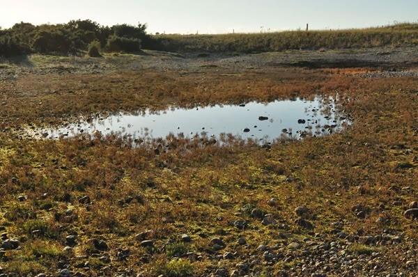
This exercise was justified in this case – a record shot of a brackish pond on a shingle bank. The flare added nothing to the image and was a distraction. I appreciate that flare can add to an image as long as it is not over done. Again this can be justified if the photographer is conveying his reaction to the scene and it re-enforces the contre-jour effect.

Wednesday, 20 November 2013

Exhibition – Farnham: What we leave behind


DPP scans025
This is just a brief write up of this small exhibition that I happened across while shopping in Farnham. There is link to a Facebook page for the exhibition here: https://www.facebook.com/wwlb.exhibition although the 4ormat.com link to the exhibition site is inactive. There are a few images on the page and I made a few notes of what I remembered of the photographs at the time.
Work by Harry Allington-Wood, Matt Fox, Katherine Haines, Emily Hopper, Jonna Pennanen & Danny Singh,
These are notes I made when I returned to my car and have expanded on since I have been able to research the images at home. Most of the photographs I have not been able to trace. Where I have found a link, I’ve written my interpretation of them.
An interesting set of images, I especially liked the presentation of one set, each image of which had been framed by a shallow wooden packing tray, the stackable type used for fruit. The images were of a hat left on a TV, a walking stick on the back of a chair, coats hanging on hooks and a watch on a bookshelf. All of these things could have been left behind, forgotten, or be  objects left by a deceased person in their home as discovered by a relative. By Emily Alyda Hopper.
Another image was of an elaborately carved memorial seat to a dead friend – intimations of immortality.
Another slant on this theme was a set of images of the lost property store at Temple Meads station in Bristol. which I think was by Matthew Fox.  A fish eye lens perspective of shelves stacked with mostly bags  briefcases and umbrellas but also bikes, all pigeon holed and labelled by week number. Passing time and a limit on reclaiming what is lost.
http://lightwalkwithme.blogspot.co.uk/2013/11/what-we-leave-behind.html This link is a  blog post of student Jonna Pennanen with three of the exhibited images. I think this is a personal blog as it is in Finnish but at least there is an opportunity to look again at the images:
‘This is a moment I want to remember’ I found this image striking because of its simplicity. The blank page invites you to remember something and the hands holding down the corners of the page, fix the moment, giving you time to remember.
The cardboard box, well it may be just discarded, it appears to be in an empty room but you can’t quite see inside so it may contain something important that has been overlooked by the previous occupier. It could be empty and represent things we no longer have. Absence.
The final image, the toothbrush and toothpaste tube on the window sill could easily be just  found objects in an empty house. I think this is less likely as a these objects are very personal and fit into a specific space in our lives. I’m reading this image as something familiar in a new place, so new, they look “out of place”, the old place having been left behind.

Friday, 15 November 2013

Reading: The Ongoing Moment – Geoff Dyer


This is the link to Sean O'Hagan's review which I read before purchasing the book:

http://www.theguardian.com/theobserver/2005/oct/16/art

I enjoyed it. A slow start but I soon got into it. A perfect foil to Art Photography Now as it concentrated mainly on the founding figures of American photography. Tongue in cheek at times it shows that there is nothing new in photography only that the same subject is interpreted differently each time a new photographer tackles it. The author writes not only about the photographs but about the lives and motivations of the photographers too. This is a book I will dip in and out of as I come across references to the work of the photographers included.

The ideas expressed have gone into the melting pot and hopefully will be absorbed and help me to  express myself photographically as I continue my studies.
Monday, 11 November 2013

Preparation for Assignment 3 – Monochrome


For this assignment, I have chosen a narrative theme which documents the removal of a Scots Pine tree from my garden. I wanted to mark the passing of this tree. It has stood for more than 100 years and survived the 1987 storm. Its proximity to the house and the increasing severity of winter storms meant that I had to have it removed. Fortunately, my fears were justified as the base of the trunk had started to rot. The tree surgeon told me that in three years it would have become dangerously unstable.
The photographs were taken over three days, the first in bright autumn sunshine the remaining two days were wet and overcast. The nine prints that I have made should be viewed in chronological order and as a start I have laid out this “contact” sheet as a guide. The prints are read from the top and left to right:
DSC_3958_first_edit_print_copy_web
3958
 
DSC_3949_1_print_copy_web
3949
DSC_3954_print_copy_web
3954
DSC_3965_1_print_copy_web
3965
DSC_3969_print_copy_web
3969
DSC_3970_print_copy_web
3970
DSC_3977_print_copy_web
3977
DSC_3979_print_copy_web
3979
DSC_3982_print_copy_web
3982
I have asked my tutor to look at this post as the course notes suggest 5-10 prints. Sharon has already seen a tentative idea of the assignment at the Study Group on 19th October. While I am waiting for feedback I will start a post to my DPP Assignments blog and write up what I did to achieve these monochrome conversions.

Monday, 28 October 2013

Project: Black and white


Exercise: Colours into tones 2

DSC_2509_edit01_web
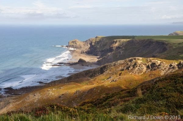
For this exercise I have chosen a landscape to enhance the aerial perspective. This is the original image.


image
Here is the default black and white conversion in Silver FX Pro.


image
Here is the enhanced version in which I have increased the contrast slightly by applying a 76% filter strength to the red channel (18 degrees on the colour wheel) which has darkened the blue of the sea.


DSC_2799_edit 02
I thought I would repeat the exercise with this more dramatic image from my archive.


image
Default conversion in Silver FX Pro


image
By applying a 100% filter to the yellow hues, the contrast of the sunlight area in the centre has been increased and the plants in the foreground have been made lighter, making them more prominent.


Conclusion: This was a useful exercise in learning how to adjust the different channels and to see what effects can be achieved.

Sunday, 27 October 2013

Project: Black and white


Exercise: Colours into tones 1

DSC_9594_web
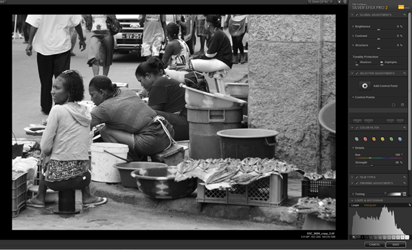
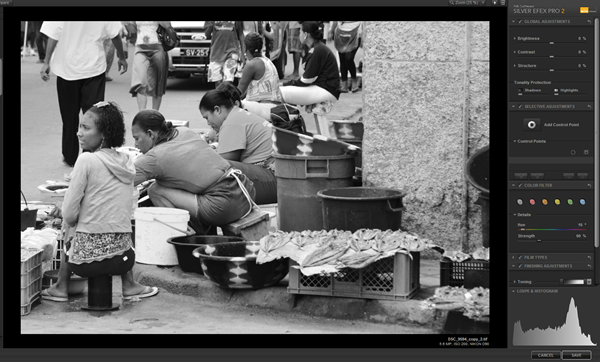
Following the notes in the course folder, I used Silver FX Pro to process this image (RAW files are processed and saved as TIFFs in this application) of fish sellers in Mindelo, Sao Vicente CV:


image
This is the default generated by the Black and White conversion option on the filter menu, showing the default settings in this screen shot with no colour filter applied.


image
Concentrating on the the lady with the red t shirt and the green bowls behind her, this is the first adjustment; lighten the red: Hue 16 degrees, strength 60%. The red t shirt is lighter and the green bowl is darker.


image
Reversing the adjustment lighten the green; Hue 109 degrees, filter strength 68%. This has darkened the red considerably.

Conclusion: The three images above have a fairly even distribution of tones but because of the effect on the skin tones, the effect of lifting the red has a more pleasing effect and makes the image tones appear to be better balanced i.e. less dark tones overall.

Project: Black and white


Exercise Strength of Interpretation
The objective of this exercise is to process two images into black and white and demonstrate that the processing applied to colour images will be less marked than the effects on the black and white images.  Here is the first which I think is more suited to a low key black and white image:

DSC_2002_mono_HK DSC_2002_mono_LK

High key

Low key
DSC_2002_HK DSC_2002_LK

DSC_2002_web Processing: Both the black and white and the colour images received the same processing. The original image (left) is as it came from the camera and was processed from RAW.

High key  Brightness: + 63%
Contrast: – 25%

Low keyBrightness: - 8%
Contrast: + 8%

As mentioned in the notes, the effect is more marked in the black and white images although the high key colour image is more contrasty that the black and white high key image.

My second image I think is more suitable for a high key black and white image:
First of all, the original:
DSC_1982_web

DSC_1982_HKmono_web DSC_1982_LowKey_web
DSC_1982_HK_colour_web DSC_1982_LK_colour_web

These are the values used for the high and low key images, both colour and black and white.

High Key: Brightness: +39%
Contrast: + 45%

Low Key:Brightness: –14%
Contrast: – 35%
In addition to this adjustment, the low key image was improved by the use of a red filter adjustment which darkened the green tones on the mountain side:
Colour: 0°
Strength: 66%
 
Conclusion: This exercise clearly demonstrates the importance of being able to see colours as tones in black and white and how extremes of tone can be used to create interesting effects in high and low key images.