This is my Learning Log for the Digital Photographic Practice Course
This is my learning log for the OCA Ditigal Photographic Practice course
Wednesday, 21 November 2012
Reading: Ansel Adams - Trees
I’m sure I’ve looked at this book before because subconsciously I have mimicked Adam's compositional style over the years. I’m lucky enough to live in a wooded part of the country – whether I look to the front or rear of my home, I see dozens of trees. Trees are probably our most visible and constant companions in nature and arouse great passion. This is shown by the breadth and depth of literary quotes which accompany the photographs in this book. It’s a shame the images aren’t bigger – barely 7 inches on their longest side. They would have more impact on a gallery wall.
This book is a veritable catalogue of trees, large, small, alone, in forests, in leaf, bare, tall, short, straight, twisted, deciduous, coniferous, alive and dead. In detail and in distant vistas, all aspects of the form and shape of trees seems to be covered by this volume.
It is tempting to dismiss Adam’s work as old hat because it has been around for so long. His style has been copied and mimicked, his photographic locations have been re-photographed thousands of times. Despite this there is still a lot to be learned from his meticulous nature and extraordinary mastery of exposure, remembering that the zone system he pioneered is now taken care of instantaneously in incredibly sensitive digital systems. I may be able to seek inspiration from his style but never produce prints with such tonal range using just sheet film, paper and chemicals.
Tuesday, 20 November 2012
Study Visit: Brighton Photo Biennial
Cairo Divided was a collection of photographs pointing at the differences between the haves and have-not's in Egyptian society despite the recent revolution. Picturing the new overspill development in the western desert of new suburbs for the wealthy of Cairo, the differences between the wealthy developers, the building workers and security guards is shown by large houses and apartment blocks, golf courses, concrete walls and iron gates put up to exclude the undesirable. This seems to be a new community out of the reach of the majority, a world away from the overcrowded slums of the city. I was impressed by the quality of these images, printed in a square format. Badlands Corinne Silva’s work is similar in that it deals with the development of south eastern Spain and contrasts the plush new mansions built for the wealthy with the plastic shrouded shanties occupied by the African immigrants who are labouring on them. Also included are photographs of billboards showing Moroccan landscapes erected in southern Spain. I’m not sure why. The explanation in the Photoworks BPB edition made no sense to me and I read it four times! 2. Five Thousand Feet is the Best: Omer Fast
Tuesday, 23 October 2012
Study Visit – Prix Pictet at the Saatchi Gallery
"The global award in photography and sustainability" is the description we have to go on. This years' theme is "Power". From the work on display the multiple interpretations of the word have been shown, whether is the power of nature, the use and misuse of political power, power shown by the use and misuse of resources. There is a very broad interpretation of the brief. All of the work on display included one or more of these interpretations.
From the website, it appears there were 12 photographers short-listed. http://www.prixpictet.com/power/artists/ I won’t discuss the work of each, only those whose images provoked discussion amongst the group. There are 10 images in each portfolio but not every image in each one was selected for display. This may have been a limit of available space or some other factor. It did seem odd that only a handful of the images by Luc Delahaye were shown.
The introduction to the study visit posed some questions:
Who would you choose to be the winner and more importantly, why?
Not knowing the criteria that the judges were using and bearing in mind that entry to the prize competition was by invitation only, choosing a winner would not be that easy. By inviting entries from established photographers, perhaps the competition starts with a short-list? I can see more merit in some work than in others.
If I make my judgement on the basis of the portfolio that make me think the most about power and the abuse of power then, Guantanamo by Edmund Clark. I'm assuming that censorship prevented Clark from showing any of the inmates. Their absence from the pictures speaks volumes. Very little else needs to be said. However, the sustainability portion of the brief is not obvious to me (thinking environment rather than human rights)
If I was to choose a winner based on visual impact and appeal, then Daniel Beltra’s Oil Spill series represents the danger of our greed for power (energy) to the sustainability of our environment.
Do you agree that it is odd that Luc Delahaye is the winner?
In some respects, yes. The content of his submission seems, on first sight, a bit hit and miss in comparison with the other photographers themes. At a second look had me searching for a clear pattern or contrast (theme) amongst his images without success I then looked at his artist's statement and I understood that he was interested in the narrative of ordinary people taking collective action either in tragic circumstances or actions that can lead to tragedy. He concludes with these words;
"It's clear that I don’t really photograph the world as it is, but either as it should not be – hardship – or as it should be – man restored to history, an uncertain destiny yet a possibility of fellowship."
Having read this I could identify his interpretation of the theme, Power.
The 132nd Ordinary Meeting of the Conference (OPEC Vienna) http://www.prixpictet.com/portfolios/power-shortlist/luc-delahaye/luc-delahaye-002/ prompted a lot of discussion amongst the group. It is enigmatic in that what appears to be a press conference seems to be very lively. I looked up the OPEC documents for the meeting but I am no scholar of the politics of oil production but at this meeting there was an agreement to raise production levels to stabilise the price of oil and a resolution to hold the next ordinary meeting in Iran. So what was it that prompted what appears to be such great excitement? Perhaps amongst oil pundits, that is enough.
Of the 10 images shown, my favourite is "Les Pillards" http://www.prixpictet.com/portfolios/power-shortlist/luc-delahaye/luc-delahaye-010/ showing looters in Port au Prince Haiti. Classic narrative, context and a decisive moment. A fraction of a second later and the expressions on the looter's faces would be lost.
Mohamed Bouroussia's images "Periferique" also provoked discussion. In particular, we talked about the image; Le Cercle Imaginaire http://www.prixpictet.com/portfolios/power-shortlist/mohamed-bourouissa/ . and discussed what was happening in the picture. Bouroussia stages his images in the suburbs where he grew up in France. Various interpretations of the image from the group included an attempt at intimidation or some sort of initiation. Clive White reiterated that we should attempt to make our images ambiguous to promote discussion. You need to raise a question in the mind of the viewer. This is borne out in this extract from the artist's statement; ...."all becomes a theatre that juxtaposes ambiguity, disquiet and a latent, if dormant violence." I was intrigued by another of his images, Le Reflet showing a figure huddled in front of a pile of old TVs. In one you can see his reflection and that of two other men in the background. You instinctively want to know what is happening. A closer look a the pile of sets shows that at least two are connected to a power supply, you wonder why? Is this man selling recycled TVs or is this an allegory for a broken society?
Apart from Edmund Clark's submission, there were three other portfolios which were marked by an absence of human figures but not without evidence of human action. Rena Effendi's "Still Life in the Zone", a play on words, has a haunting quality. I'm reminded of the feeling I got as a teenager reading post apocalyptic science fiction novels such as Level Seven by Mordecai Roshwald and On the Beach by Neville Shute which contain descriptions of radiation ravaged landscapes as humanity slides irrevocably towards annihilation, haunting definitely but in this case, not without hope. The second portfolio is Phillippe Chancel's Fukushima, an almost clinical presentation of scenes of destruction after the Japanese Tsunami, complete with Google earth views of each location. Here is the power of natural forces putting mankind in its place, brushing us aside like an irritant. The third portfolio we discussed was that of Jacqueline Hassink, "Arab Domains" in which she presents a glimpse of the boardroom and dining room tables of powerful female business leaders from Arab states. While the motivation and purpose behind the series was interesting and commendable the photographs weren't. I've seen more interesting furniture catalogues. Without the lengthy, wordy explanations from the artist or Charlotte Cotton, I wouldn't have a clue what the series was about. The series failed to engage me. A comment from overheard from one of the other students/tutors was how remarkably similar the boardrooms were to the dining rooms. Does that mean that the boardrooms were homely or the dining rooms were business like?
Another portfolio which we discussed was "29 Palms" by An-My Le. This caught my interest as it was one of two submissions solely in black and white and it involved military training, something which happens close to my home and which I have a peripheral interest as an MOD employee in the Army Education Service. While found the images a bit pedestrian, the photographers' method of using a large format plate camera removed her from the "action" and she undertook the documentation of the live firing exercises much in the same way as Brady and Fenton on the battlefields of Crimea and the American Civil War in the 19th century. I liked the impact of the image Night Operations III and curiously realistic graffiti on the buildings in the Security and Stabilisation Operations, Graffiti. http://www.prixpictet.com/portfolios/power-shortlist/an-my-le/ At this point I had an idea to pursue a project on the SEME Recovery Training area, subject to clearance and safety permissions. An idea to develop for the future.
This was a very worthwhile study visit which I found interesting. I think I have learned a lot about how to look and and appraise images. Certainly a great improvement on my engagement with my first study visit earlier this year.
Wednesday, 26 September 2012
Project–A sequence of actions–concluded
Exercise 2: My own workflow for an open ended assignment
I decided to make a few notes on my selection process for the “Shooting from the navel” project. I have started selecting images for the first selects folder. While I am doing this I am also forming in my mind what sort of images I want to show. These are some of the ideas I have had:
- Fleeting moments captured but made permanent
- First impression
- Public selves
- Look for narratives
- How people respond (to finding they have been photographed) Add an explanation to the site offering to remove images if they are unhappy with being shown. Try to find out why? In the introduction, explain about spontaneity and that you are seeking a reaction, from the subjects if possible and from the viewer
- When editing, look for something in an individual's expression or a certain juxtaposition in a group that makes the image interesting or provides narrative.
- I think fifteen to twenty images for the first gallery will be enough.
An example of my editing technique is shown by the screen shots below as I select and crop various versions to put forward to my First Selects folder.
In this particular folder I selected two images and converted them to black and white tiffs using Silver FX Pro 2
I then made different crops of these two images to find different combinations of the various characters in the frames. From here I will make First Selects and subsequently my final selections. It is interesting to note that these particular images did not make it to the final selection. I also modified my cropping. As looked at the images I could see that there was a lot more to some of them than I first observed. This resulted in most of them being cropped minimally. The street is the context in which the figures are reacting and so deserves to be included. Those that have been cropped to portrait format however, have been cropped to isolate particular figures.
Final Selection:
I have uploaded my final selection to my web gallery. Click the image to view the gallery in a separate window. If you wish to comment, please return to this page and use the comment link below.
At this stage I have not made any effort to theme the images, I have made a selection based those that I find the most interesting and appealing.
Conclusion: This exercise has been the most challenging in this first part of the course, purely from the sheer number of images involved. This was good practice however as Assignment 1 has generated over 150 images which I shall now start to edit.
Wednesday, 29 August 2012
Project–A sequence of actions
Objective: To write a workflow for an open ended assignment in which the number of images will be unpredictable and in this case, take place on different dates in different locations. The initial stage will always be the same. Note the differences between this and the structured, time limited assignment.
Exercise 2: Your own workflow 2
My own workflow for an open ended assignment:
For this exercise I am going to record a workflow for a street photography project I started several months ago. I call it “Shooting From the Navel”, a more literal description of a style of candid photography sometimes called “shooting from the hip”.I tend to do this in bright conditions and try to use a small aperture and reasonably fast shutter. I use auto ISO setting with 1/125s as a minimum. I started in Boa Vista in Cape Verde last February. I have shot in Regents Street, London, in Oxford, Falmouth and Chichester. This is still an experiment but I have a few interesting images which are languishing in folders on my external hard drive. This exercise will push me to bring it to the top of my to do list.
Before leaving home:
- Check Camera and lenses are clean, charge battery and spare
- Check and format SD Cards - Use in rotation
- Check camera bag for equipment, lens tissue, blower brush, SD card cases
- Notebook, pencil, mobile phone
- Travel to Location
On arrival at location:
- Final check on camera settings, exposure mode, white balance, image quality (RAW +JPEG)
- Find a suitable location in the street where I can stand out of the way but have a good view of approaching pedestrians.
- Occasionally shoot while walking slowly along the street
- Record SD cards used and store in cases
Editing:
- Download images to PC
- Store images in a “Location” folder prior to processing
- Technical edit – look at images in the browser and remove those under/over exposed, blurred etc.
- Consider images with potential and follow workflow below

Conclusions: As I already have a lot of the images for this project, the flow diagram above has put my workflow into context and will hopefully enable me to get on with the editing process. The main barrier to getting on with this was that I had images all over the place. Now I have organised them into specific folders, I can progress with confidence. My next post will show the “results so far” .
Tuesday, 28 August 2012
Project: Editing
Exercise 4: Editing
Background for Assignment
Technical Edit: Next I eliminated any views of the house that were not in full sunshine, blurred, wrongly exposed etc., leaving 34 “selects” from which to choose technically fine images.

First Selects: From these I selected 7 images for my first select, marked with a red 1. After a couple of hours I went back to look at these and confirmed to myself that they were my final choices.

A Final Choice: I have chosen these two images as my final choices (marked with a green 4) for the following reasons:

Conclusions: I have found this a very useful exercise. I would not normally go to so much trouble when selecting images but I was pleased to find how easy it was once I had decided on a way of marking and filtering my selections. Hopefully the brief for a real shoot would have been a lot more specific and I would have started with less images. Had it been a speculative shoot for stock, it may have been more difficult but I would have imposed my own limits on what and what not to shoot.
Saturday, 25 August 2012
Project: Histograms
Exercise 3: Histogram
Objective: To increase my familiarity with the histogram by relating it to images I have just shot.
I used the manual setting on my camera and auto bracketing , 3 shots with 0, +1 and –1 EV
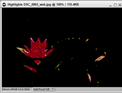
Highlight and shadow clipping display: Capture NX2 will show a detailed image of lost shadows and highlights using different colours for different channels but does not display a warning. My camera shows only overexposed highlights on its LCD screen.
 |
Image 0896
1/200s
f11
-1.0 EV
ISO 200
28mm
|
 |  |
| Lost Highlights | Lost Shadows |
High Contrast +1.0 EV

 | Image 0897 1/50s f11 + 1.0 EV ISO 200 28mm |
 |  |
| Lost Highlights | Lost Shadows |
High Contrast 0 EV

 | Image 0898 1/100s f11 0 EV ISO 200 28mm |
 |  |
| Lost Highlights | Lost Shadows |
 | Image 863 1/100s f11 0 EV 400 ISO 200mm |
 |  |
| Lost Highlights | Lost Shadows |
Average contrast –1.0 EV

 | Image 864 1/200s f11 -1.0 EV ISO 400 200mm |
 |  |
| Lost Highlights | Lost Shadows |
Average Contrast +1.0 EV

 | Image 865 1/50s f11 +1.0 EV ISO 400 200mm |
 |  |
Lost Highlights
| Lost Shadows |
Low Contrast + 1.0 EV I was struggling to find a low contrast scene to shoot so I waited until dusk and took s photograph of my back garden.

 | Image 0900 1/2.5s f11 +1.0EV ISO 3200 22mm |
 |  |
| Lost Highlights | Lost Shadows |
Low Contrast 0 EV

 | Image 0901 1/5s f11 0 EV ISO 3200 22mm |
 |  |
| Lost Highlights | Lost Shadows |
Low Contrast –1.0 EV

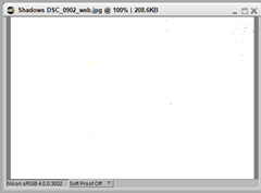
 | Image 0902 1/10s f11 -1.0 EV ISO 3200 22mm |
 |  |
| Lost Highlights | Lost Shadows |
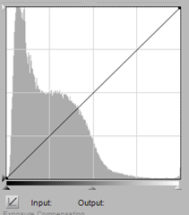
With underexposure, the tones move further to the left of the histogram but still with minimal clipping and no shadow blocking.
Conclusions: I have been familiar with the purpose and use of the histogram for some time. I regularly under expose my images using the exposure compensation control ay my camera’s settings tend to produce slightly over exposed images. I have noticed the difference between the histograms for jpeg and raw images and will make allowances for this on converting from RAW to jpeg files.
This has been a useful exercise to consolidate my knowledge
.
Project–a sequence of actions
Exercise 1: Your own workflow 1
Objective: Devise and then put into practice a workflow that suits you personally for a specific short assignment and make notes of your experience of this in your learning log.
Assignment: Produce photographs of a National Trust property suitable for publication in a tourist brochure or information sheet. (had this been a professional assignment I would have contacted the National Trust. I checked their photography policy and as student assignment, I treated this as a “not for commercial use” exercise)
My own workflow for a time limited assignment:
Before leaving home:
- Check Camera and lenses are clean, charge battery and spare
- Check and format SD Cards - Use in rotation
- Check camera bag for equipment, lens tissue, blower brush, SD card cases
- Notebook, pencil, mobile phone
- Drive to Location
On arrival at location: (2 hours 1300 – 1500)
- Final check on camera settings, exposure mode, white balance, image quality (RAW +JPEG)
- Check light quality and direction in relation to the subject
- Walk around the location to find suitable viewpoints. Make a note of the ones you want to use
- Commit a few images to SD card to check for exposure (highlight and shadow clipping from the histogram) Adjust exposure compensation accordingly
- When the light is right, shoot the chosen locations.
- Allow time for the sun to move to highlight areas of the scene if necessary
- Record SD cards used and store in cases
- Return home to edit images
Image Editing
- Transfer images to PC
- Perform technical edit
- Select satisfactory images from those remaining
- Make first selects
- Find several of the best images
- Review your best selection
- Process images (see personal workflow here)
- Choose two images for submission
Conclusions: I designed the workflow in light of my experience with the Art of Photography assignments that involved a specific project (i.e. Liphook Carnival) and I am pleased to say it worked very well. There is nothing I would change and the only problem I had was waiting around for people to move out of shot and/or for the clouds to move away from the sun. Luckily the two hours I allowed, had some contingency built in for this reason.
Sunday, 19 August 2012
Project – A sequence of actions
Exercises 1 and 2
Workflow: As suggested in the learning materials, I will complete these exercises as part of later assignments.
Meanwhile I thought it would be a good exercise just to note down what my current practice is.
- Check camera and lenses are clean
- Charge battery and spare
- Check camera bag for equipment (lenses, HD cards, lens tissues, notebook, pencil etc.)
- Reset camera to default settings
- Change settings to the situation. (I have two basic schemes depending whether I’m shooting indoors or out)
- Shoot
- Remove SD cards and store in cases.
- Load images onto PC using Nikon Transfer. (Images are saved to external and internal drives and after processing are archived to CD and indexed)
- View in Capture NX2, delete any gash files
- Select acceptable images and grade them
- Geometric corrections. (crop, lens distortion, horizontal and vertical corrections)
- Remove colour casts (white balance adjustments)
- Initial retouching (spots, dust etc. using auto retouch)
- Adjust tone and contrast
- Perform colour correction (global or local)
- Final tweaks
- Sharpen and output the image


