This is my learning log for the OCA Ditigal Photographic Practice course

Monday, 27 May 2013

Project: Dynamic range


Exercise 4: Your camera’s dynamic range
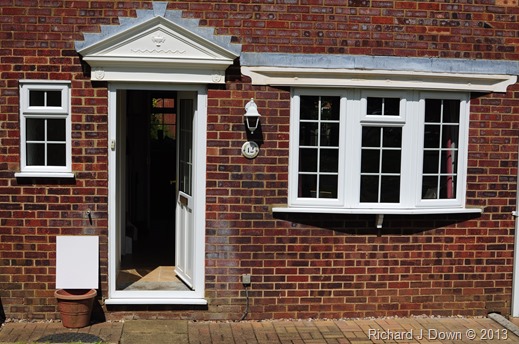
The brief for this exercise was to measure the the exposure values of  levels of brightness and shadows within a scene containing bright sunlight and deep shadows. This would enable me to determine the dynamic range of of my camera.
DSC_2969

With the ISO setting at 100, I photographed the scene with the exposure set so that there was no highlight clipping of the white card. The exposure was 1/800s f6.3 with the metering set for the average of the whole scene.
The various meter readings, taken with the spot meter on my camera are as indicated on the sketch below:

DR Sketch

image
From the watch point sampler it can be seen that the average value for the white card at this exposure (1/800 @ f11) is 224…..

image
….and the average for the deepest shadow area of the image is 2 (1/800 @ f1.8).
image
By adjusting the exposure value 2 stops and moving the the brightness slider, you can see the noise starting to appear on the margin between the floor and the edge of the door. This represents the darkest shadow of the image that could be recorded. The dynamic range for my camera can therefore be determined over the range f1.8, f2, f2.8, f4, f5.6, f8 and f11 = 7 stops (35mm f1.8 fixed focal length lens).
Conclusion: I was somewhat surprised by the restricted dynamic range of my camera/lens combination. The image does look a bit “muddy” and maybe could have received a little more exposure. If the weather conditions allow, I may repeat the exercise using a grey card to determine the overall exposure. It may be that the average matrix for exposure is not that accurate.

Exercise 5: Scene dynamic range
Objective: To take five differently lit scenes and within each, find and measure the darkest and brightest areas. Using the spot meter on my camera I metered the brightest and darkest areas of the scenes and recorded them below:
Scene 1: 2979 1/60s f4.5 ISO100 60mm
The scene is fairly flat, lit by an overcast sky with no sunlight. I deliberately excluded the sky.

DSC_2979_web
I identified the white sign at right as the brightest part (f7.1) and the hull of the second boat as the darkest (f4) The matrix metering gave an exposure of f4.5 at 1/60s. (I have my camera meter set at 1/3 increments so the range is f4, f4.5, f5. f5.6, f6.3, f7.1, f8 etc.) The range for the scene is therefore one and two thirds stops.

Scene 2: 2980 1/100s f4.5 ISO100 35mm
I chose this scene to illustrate the effect of a bright but grey sky on the exposure of the whole image.
DSC_2980_web
The meter reading for the sky was f22 (at 1/100s) and for  the darkest area of shadow (bottom) left, f7.1., a range of  three and one third stops.The matrix metering function gave an exposure of f4.5 at 1/100s which resulted in the sky burning out completely but there are still details in the shadows at bottom left.


Scene 3: 2985 1/10s f8 ISO400 70mm (matrix metering)
This scene is lit from a north facing window, the sky outside is overcast.
 DSC_2985_web
The lightest part is f11 and the darkest, f6.3 showing a range of one and two thirds stops.


Scene 4: 2989 1/125s f9 ISO100 70mm (matrix metering)
This scene is lit by bright sunlight diffused by thin high cloud. The sun is high in the sky.
DSC_2989_web
Using the spot meter function of my camera I determined that the seed head gave a reading of f13 and the background green hues gave a reading of f6.3. A range of 2 stops. A fairly neutral scene in terms of contrast.

Scene 5: 2992 1/80s f7.1 ISO100 18mm (matrix metering)
This is the high dynamic range which includes the sun in the frame.

DSC_2992_web
The range for this image is f3.5 for the shadows and f22 for the highlights, equal to five and one third stops.
Conclusions: I found this exercise valuable in terms of a demonstration of  the limitations of exposure and the rendering of the entire range of exposure values within a scene. This has reinforced the valuable lessons I learned from working with film and bracketing exposures half a stop above and below that indicated by the light meter. From experience I know that my Nikon D90 gives a better exposure if I under expose by 0.7 (matrix metering). I have experimented with using a grey card to measure exposure and have got some results but I have yet to find an accurate comparison with the more sophisticated electronic metering system in my digital SLR.
The maxim that I used to apply  to film was “expose for the shadows, develop for the highlights” The reverse holds true for digital processing. If you are using RAW format, correctly exposing for the highlights and then processing the RAW image to bring up details in the shadows can work well. Producing correctly exposed images in jpeg format for the next assignment will be a challenge. I will use bracketing and do some more experiments with the grey card.



Tuesday, 14 May 2013

Project: Noise


Exercise: Your tolerance for noise.
For this exercise I made a series of identical images using the full range of the ISO settings on my camera. (from ISO 100 to ISO 6400 in 1/3 stops – 19 in all) The aperture for each image was constant (f6.3) and the shutter speed ranged from 1/250 to 1/4000 sec. Noise reduction was turned off. For comparison, I have included details of only the first, tenth and nineteenth images and for each I have shown the details of the textured and untextured parts of the image to demonstrate the effect of increasing the ISO sensitivity on different parts of the image.
Here is the whole image:
2928 f6.3 1/250s ISO100
DSC_2928_web
Here is a table of the images comparing the results for the textured and untextured areas of the image, in sunlight and shade, at ISO 100, 800 and 6400:
ISO 100
DSC_2928_crop_web_texture_ISO100 DSC_2928_crop_web_textureless_ISO100
ISO 800
DSC_2937_crop_web_texture_ISO800 DSC_2937_crop_web_textureless_ISO800
ISO 6400
DSC_2946Crop_web_texture_ISO6400 DSC_2946_crop_web_textureless_ISO6400
Conclusion: From the images above, it can be seen that noise in the textures of the cloth is not so easy to distinguish. At high ISO the texture seems to be less sharp with some occasional coloured artifacts. at ISO 800 there appears to be no appreciable difference. On the other hand, where there is no texture, at ISO 100  there is little noise, at ISO 800 more granular structure and colour banding and at ISO 6400 there are distinct clumps although the colour banding seems to have gone. Although this exercise was a bit hit and miss as far as control over the lighting is concerned, it clearly demonstrates the relationship between ISO sensitivity and apparent noise in different parts of the image.

Saturday, 30 March 2013

Project – Highlight clipping


Exercise 2: Highlight clipping
Shown below are the 5 images produced for this exercise, separated by 1 f stop, as described. I have cropped the original framing to show the area of clipping i.e. the white painted bridge parapet to the left of the frame. It is also useful to have the grey painted concrete area in the crop as an inbuilt grey card. My camera shoots in RAW (NEF) and produces a jpeg file as well. I have used this file for the first part of the exercise.
1: Original image with highlights just clipped 1/800s f10
DSC_2122_web_as shot

1A: Cropped image showing highlights: The white bridge has very little detail and is mostly pure white.
DSC_2122_web_as shot_crop

2: Cropped image – exposure increased by 1 stop: 1/800s f7.1 There is a lot less detail and the surrounding image is beginning to lose saturation
DSC_2125_web_as shot_crop


3. Cropped image – exposure decreased by 1 stop from the original: 1/800 f14 There is a lot more detail here, the algae on the paint, the shadows and the detailing on the pillars is now apparent. The sun’s reflection from the black bin bag in the bottom left is still clipped. Colour saturation appears just a little muddy.
DSC_2127_web_as shot_crop

4. Cropped image – exposure decreased 2 stops from the original: 1/800s f20 The image shows a lot more detail on the parapet now  but the shadows on the image are now blocked up and the contrast needs adjusting.
DSC_2128_web_as shot_crop


5. Cropped image – exposure decreased 3 stops from the original: 1/800s f29 Here the white on the wall is very muddy and the image is underexposed. Curiously the white sunshades in the background are still white showing that they were very strongly clipped.
DSC_2129_web_as shot_crop

I took my images in RAW (NEF) but as I am using Capture NX2 there is no separate process required for conversion. I always have my camera produce a .jpeg for each NEF file. I tend to process in the other direction i.e NEF files to high quality .jpeg or .tiff files. As Capture NX2 is non destructive, I can store and recover all edits to a NEF file and save a number of versions. I do have a new version of PS Elements which came bundled with a recent purchase. I’ve looked at the Recovery slider and seen how it works. As my workflow has long been established in NX2, I will use the  Auto Levels menu and the double threshold feature to reprocess the images and recover the highlight information.
For the first Image (1A) I will document the process using screen shots:
1. Here is the cropped image unprocessed showing the original histogram.

image


2. Clicking the Double Threshold box on the RGB histogram shows the lost highlights (white) and blocked shadows (black) against a grey background.

image


3. Adding Auto Levels to the edit list removes the highlights from the display.

image


4 Un-ticking the double threshold box reveals the edit and clicking Advanced in auto levels gives the option to adjust the contrast and colour cast.

image


5. I think this image is a little blue so I adjusted the colour (-22%) and increased the contrast by 6%.
image


7. The final image show no appreciable difference to the Quick Fix histogram but there is a marked shift in the distribution of the RG & B channels.
Before After
image image


image


8. Checking the Double Threshold box again reveals no highlight values but does show that the blocked shadows are starting to increase.

image

Here are the remaining four images processed as above.
2. This image is more saturated than the original and a lot of the highlights have been recovered but is still not ideal. Again the threshold shows that the shadows are starting to block.

DSC_2125_crop_processed

3. Although the lost highlights on the bridge have been recovered, it is at the expense of the overall contrast. I’ve adjusted it and the result is a compromise.

DSC_2127_crop_processed

4. Auto Levels is now starting to work in the other direction for this underexposed image. I can see from the Double Threshold that the highlight areas have increased slightly and the blocked shadows have gone.

DSC_2128_crop_processed

5, With this final underexposed image although the highlights have been restored, the surrounding areas are still very under exposed.
DSC_2129_crop_processed
Conclusions: This exercise has served to demonstrate the limitations of digital processing with regard to the way in which a linear processer records an image compared to film or the human eye. I have also come to appreciate how these effects can be mitigated by software and the limits that apply to what software can achieve. However, with the rapid pace of change in digital sensors and processing software many of these limitations may already be in the process of being overcome.

Friday, 29 March 2013

Project – Linear capture


Exercise 1 Sensor linear capture: Objective – to demonstrate the difference in the way that a digital sensor captures light information compared to the eye or film.
Using CaptureNX2, I converted this file to from RAW to a 16bit TIFF using  the save options dialogue box:
image
I applied the curve to the histogram and saved the image:
image
Here are the two histograms from the saved images demonstrating the difference between the processed and unprocessed image:
Unprocessed image Processed image
image image
Following on, I have applied an adjustment curve to the linear image to bring it back roughly to the processed file and it can be seen that the curve is the reverse of the adjustment I made to the tiff image. This exercise has also made clearer how to interpret and use the information provided by the curves histogram.
image

Wednesday, 21 November 2012

Reading: Ansel Adams - Trees


I’m sure I’ve looked at this book before because subconsciously I have mimicked Adam's compositional style over the years. I’m lucky enough to live in a wooded part of the country – whether I look to the front or rear of my home, I see dozens of trees. Trees are probably our most visible and constant companions in nature and arouse great passion. This is shown by  the breadth and depth of literary quotes which accompany the photographs in this book. It’s a shame the images aren’t bigger – barely 7 inches on their longest side. They would have more impact on a gallery wall.
This book is a veritable catalogue of trees, large, small, alone, in forests, in leaf, bare, tall, short, straight, twisted, deciduous, coniferous, alive and dead. In detail and in distant vistas, all aspects of the form and shape of trees seems to be covered by this volume.
It is tempting to dismiss Adam’s work as old hat because it has been around for so long. His style has been copied and mimicked, his photographic locations have been re-photographed thousands of times. Despite this there is still a lot to be learned from his meticulous  nature and extraordinary mastery of exposure, remembering that the zone system he pioneered is now taken care of instantaneously in incredibly sensitive digital systems. I may be able to seek inspiration from his style but never produce prints with such tonal range using just sheet film, paper and chemicals.

Tuesday, 20 November 2012

Study Visit: Brighton Photo Biennial

  It has been over a week since the OCA study visit to Brighton. I thought it was about time I put finger to keyboard and summarised the weekend. (lots of other stuff has been going to distract me, some course related, some not) The title of the biennial “Agents of Change: Photography and the Politics of Space” is reflected by work of the widest possible interpretation of the theme. The effectiveness of photography as an agent for change is an on-going debate, beyond the scope of this review but all of the exhibitions we saw provoked thought and comment. At the end of the review I will attempt to summarise my own feelings on what I understood and gained from the weekend. Descriptions and images from the collections can be found at the BPB website: www.bpb.org.uk The introduction and first morning was at the University of Brighton Galleries and we looked at three exhibitions here: 1. Jason Larkin and Corinne Silva "Uneven Development" (Comprising images from Larkin's Cairo Divided and Silva's Badlands)
Cairo Divided was a collection of photographs pointing at the differences between the haves and have-not's in Egyptian society despite the recent revolution. Picturing the new overspill development in the western desert of new suburbs for the wealthy of Cairo, the differences between the wealthy developers, the building workers and security guards is shown by large houses and apartment blocks, golf courses, concrete walls  and iron gates put up to exclude the undesirable. This seems to be a new community out of the reach of the majority, a world away from the overcrowded slums of the city. I was impressed by the quality of these images, printed in a square format. Badlands Corinne Silva’s work is similar in that it deals with the development of south eastern Spain and contrasts the plush new mansions built for the wealthy with the plastic shrouded shanties occupied by the African immigrants who are labouring on them. Also included are photographs of billboards showing Moroccan landscapes erected in southern Spain. I’m not sure why. The explanation in the Photoworks BPB edition made no sense to me and I read it four times! 2. Five Thousand Feet is the Best: Omer Fast
This was an interesting video with a chilling message. This looped film shows the dramatised interview with an American drone “pilot” cut with redacted footage of the actual interview. Essentially, the film maker has subverted the narrative of claimed peripheral civilian casualties in Afghanistan and Pakistan by setting his story as if it were close to home. A family leave home for a trip and the father takes a wrong turning and they pass through a military checkpoint. The road becomes less busy and turns into a track. Ahead, some men are digging up the road and stop what they are doing as the car approaches. The driver slows but continues to travel forwards. As he accelerates past the men and their pick-up truck, the missile strikes and their car is caught in the blast. The men are killed and the family’s station wagon is damaged. The four occupants continue their journey on foot. The clip shown on We Are OCE http://vimeo.com/34050994 is not looped as in the exhibition but the film maker tried to show the troubled nature of the drone operator’s state of mind (he claimed to be suffering from virtual stress) not only from the post traumatic effects of the job but also from his unease at talking about his former job to a journalist in the light of threats from the CIA/FBI. The editor showed him constantly leaving the room to smoke and to pop pills to relieve his stress. Usually at this point the film looped back to another similar start point making the viewer question what he was seeing, reflecting the unease and uncertainty in the mind of the drone operator. I considered  this a very powerful narrative, one which poses more questions than it answers. 3. Control Order House: Edmund Clark
The prints for this project seemed very ordinary images of the inside of someone's house. However, in the context of the occupier and the circumstances under which he/she lives in the house, they take on a different meaning. The house is occupied by someone under and Anti Terrorist Control Order. The photographer is working under strict conditions and must not give any clue as to who lives there and where the house is. Documentation is displayed relating to the Control Order and the conditions under which the photographer must work which gives a disturbing insight into this grey area of control and legislation.
Continuing after lunch:
4. No Olho da Rua: Julian Germain, Patricia Azevedo and Murilo Godoy
“The Eye of the Street” This exhibition was shown at Fabrica, a gallery in a disused church. Essentially the three photographers worked together with children of the streets in Belo Horizonte in Brazil over a 17 year period amassing an archive of thousands of images taken by the children themselves to picture their chaotic and fragmented lives. The photographers did no more that distribute the loaded cameras, collect them the next day, process the films and distribute the prints back to the children. Apart from basic advice on the operation of the cameras, they gave no lessons or instruction. The resulting images are the spontaneous creations of the children and their friends. The objective of the project was to engage the children in some creative endeavour and to see what would emerge from it. The project has been running for 17 years and has produced some telling images which have been fly posted in the city and produced as free newspapers handed out in the street. There is a feeling of inclusion from the youngsters, being surrounded by photography and now having the means to make their own photographs have them printed and perhaps posted up or reproduced in a newspaper gives then a sense of themselves, a record of their past and something to share. This was a large exhibition with individual enprints on display on the wall and in collections of boxes. Some larger exhibition prints has also been made which were displayed on the curved dividing walls in the gallery.
5. Brighton Public Library
Again, as part of the Biennial there was a display of various books, folders, portfolios showing the wide variety of methods that can be used to present photographic and artistic collections.
Sunday: Started with a meeting at the Brighton Media Centre for group discussion. I took some prints to discuss (my first DPP assignment)  and received some valuable feedback  from my fellow students and tutors. The aim of the collection was to show the differing textures that were to be seen in the saltmarsh landscape. I came away with the impression that although individual images found favour with the viewers, perhaps the collection as a whole lacked impact. I think I need to look again at what makes a collection hang together. There is an awful lot of work that can be done as a project in the nature reserve.
We also looked at work from Eileen on trees and the course of a stream in suburban London and Catherine showed some very interesting images of pylons from a DSLR that was converted to Infra Red. Amano showed us a series from life in his village. Keith  then told us briefly about choosing units for the Level 3 section of the degree.
On view at the Media centre was an exhibition of Phil Taylor’s “The Day of the Dead” which also incorporated his multimedia presentation “Urban Ghosts” I watched some of this on the day and I have watched it all again today. It was based on Taylor’s three month stay in Arizona, around the setting of Cormac McCarthy’s novel “Blood Meridian” but I must have missed something because I found it a bit dull and over long. Nothing jumped out at me.
After lunch there was a distinct change for the afternoon as we made our way to the Phoenix Brighton (a squatted office block now used for an artists centre). There was a lot to see here including a quirky exhibit entitled: THIS IS A PICTURE I DID NOT TAKE OF A DEAD MAN IN PHOENIX in which artists described photographs they didn’t take.
Also interesting, Ghost by Cathryn Kemp “………..Kemp works with reclaimed and reconstructed vintage garments to signify emotional genealogy……”  The exhibit, photographs of four of her mother’s nightdresses, full size in display cases almost as if the garments themselves were on display, back lit.
The major (in terms of space) exhibit at the Phoenix was On the Surface of Images by Korean Jinkyun Ahn. Again surreal and beyond my understanding although beautifully shot, the photographs “..explore the relationship between Ahn’s parents and in turn his family’s relationship with death and the afterlife……….”
What was good and provoked a lot of discussion was from Glasgow Effect by Alex Currie, Chris Leslie and Richard Chivers. The link to the video by Chris Leslie about the feelings of the former resident's of 55 and 75 Plean Street is here: http://vimeo.com/29799259. This is a multimedia video documenting the demolition of two tower blocks in the city accompanied by commentary from former residents about the demise of the flats. It is unusual for a documentary in that it deliberately uses the primary colours seen inside the flats as the exterior is peeled away, to contrast the customary bleak  monochromatic depiction seen in similar situations. The former residents speak in glowing terms of their excitement of moving here from the Glasgow tenements and their sadness and disappointment that the buildings were allowed to decline because of mismanagement of the housing stock. A powerful indictment.
What did I get from the weekend?
My overall impression of the weekend and  the OCA organisation of the event was very good in all respects. I was pleased to be able to see so much in such a short time. Had I bee left to choose my own programme of exhibits, I’m sure I would have missed an awful lot. I am progressing in my understanding and appreciation of all types of photographic work (some faster than others) and I am adding to my ideas list of projects as a result. I now have a definite date for retirement so some of these projects may see light of day sooner than anticipated.  Most valuable of all is the interaction with students and tutors. My five study visits this year have done more that anything else to keep me motivated.

I also have yet to edit my video of the weekend which I hope to do very soon and will post it to Vimeo.


Tuesday, 23 October 2012

Study Visit – Prix Pictet at the Saatchi Gallery


"The global award in photography and sustainability" is the description we have to go on. This years' theme is "Power". From the work on display the multiple interpretations of the word have been shown, whether is the power of nature, the use and misuse of political power, power shown by the use and misuse of resources. There is a very broad interpretation of the brief. All of the work on display included one or more of these interpretations.

From the website, it appears there were 12 photographers short-listed. http://www.prixpictet.com/power/artists/ I won’t discuss the work of each, only those whose images provoked discussion amongst the group. There are 10 images in each portfolio but not every image in each one was selected for display. This may have been a limit of available space or some other factor. It did seem odd that only a handful of the images by Luc Delahaye were shown.

The introduction to the study visit posed some questions:

Who would you choose to be the winner and more importantly, why?

Not knowing the criteria that the judges were using and bearing in mind that entry to the prize competition was by invitation only, choosing a winner would not be that easy. By inviting entries from established photographers, perhaps the competition starts with a short-list? I can see more merit in some work than in others.

If I make my judgement on the basis of the portfolio that make me think the most about power and the abuse of power then, Guantanamo by Edmund Clark. I'm assuming that censorship prevented Clark from showing any of the inmates. Their absence from the pictures speaks volumes. Very little else needs to be said. However, the sustainability portion of the brief is not obvious to me (thinking environment rather than human rights)

If I was to choose a winner based on visual impact and appeal, then Daniel Beltra’s Oil Spill series represents the danger of our greed for power (energy) to the sustainability of our environment.

Do you agree that it is odd that Luc Delahaye is the winner?

In some respects, yes. The content of his submission seems, on first sight, a bit hit and miss in comparison with the other photographers themes.  At a second look had me searching for a clear pattern or contrast (theme) amongst his images without success I then looked at his artist's statement and I understood that he was interested in the narrative of ordinary people taking collective action either in tragic circumstances  or actions that can lead to tragedy. He concludes with these words;

"It's clear that I don’t really photograph the world as it is, but either as it should not be – hardship – or as it should be – man restored to history, an uncertain destiny yet a possibility of fellowship."

Having read this I could identify his interpretation of the theme, Power.

The 132nd Ordinary Meeting of the Conference (OPEC Vienna) http://www.prixpictet.com/portfolios/power-shortlist/luc-delahaye/luc-delahaye-002/  prompted a lot of discussion amongst the group. It is enigmatic in that what appears to be a press conference seems to be very lively. I looked up the OPEC documents for the meeting but I am no scholar of the politics of oil production but at this meeting there was an agreement to raise production levels to stabilise the price of oil and a resolution to hold the next ordinary meeting in Iran. So what was it that prompted what appears to be such great excitement? Perhaps amongst oil pundits, that is enough.

Of the 10 images shown, my favourite is "Les Pillards"  http://www.prixpictet.com/portfolios/power-shortlist/luc-delahaye/luc-delahaye-010/ showing looters in Port au Prince Haiti. Classic narrative, context and a decisive moment. A fraction of a second later and the expressions on the looter's faces would be lost.

Mohamed Bouroussia's images "Periferique" also provoked discussion. In particular, we talked about the image; Le Cercle Imaginaire http://www.prixpictet.com/portfolios/power-shortlist/mohamed-bourouissa/ . and discussed what was happening in the picture. Bouroussia stages his images in the suburbs where he grew up in France. Various interpretations of the image from the group included an attempt at intimidation or some sort of initiation. Clive White reiterated that we should attempt  to make our images ambiguous to promote discussion. You need to raise a question in the mind of the viewer. This is borne out in this extract from the artist's statement; ...."all becomes a theatre that juxtaposes ambiguity, disquiet and a latent, if dormant violence." I was intrigued by another of his images, Le Reflet showing a figure huddled in front of a pile of old TVs. In one you can see his reflection and that of two other men in the background. You instinctively want to know what is happening. A closer look a the pile of sets shows that at least two are connected to a power supply, you wonder why? Is this man selling recycled TVs or is this an allegory for a broken society?

Apart from Edmund Clark's submission, there were three other portfolios which were marked by an absence of human figures but not without evidence of human action. Rena Effendi's "Still Life in the Zone", a play on words, has a haunting quality. I'm reminded of the feeling I got as a teenager reading post apocalyptic science fiction novels such as Level Seven by Mordecai Roshwald and On the Beach by Neville Shute which contain descriptions of radiation ravaged landscapes as humanity slides irrevocably towards annihilation, haunting definitely but in this case, not without hope. The second portfolio is Phillippe Chancel's Fukushima, an almost clinical presentation of scenes of destruction after the Japanese Tsunami, complete with Google earth views of each location. Here is the power of natural forces putting mankind in its place, brushing us aside like an irritant. The third portfolio we discussed was that of Jacqueline Hassink, "Arab Domains" in which she presents a glimpse of the boardroom and dining room tables of powerful female business leaders from Arab states. While the motivation and purpose behind the series was interesting and commendable  the photographs weren't. I've seen more interesting furniture catalogues. Without the lengthy, wordy explanations from the artist or Charlotte Cotton, I wouldn't have a clue what the series was about. The series failed to engage me. A comment from overheard from one of  the other students/tutors was how remarkably similar the boardrooms were to the dining rooms. Does that mean that the boardrooms were homely or the dining rooms were business like?

Another portfolio which we discussed was "29 Palms" by An-My Le. This caught my interest as it was one of two submissions solely in black and white and it involved military training, something which happens close to my home and which I have a peripheral  interest as an MOD employee in the Army Education Service. While found the images a bit pedestrian, the photographers' method of using a large format plate camera removed her from the "action" and she undertook the documentation of the live firing exercises much in the same way as Brady and Fenton on the battlefields of Crimea and the American Civil War  in the 19th century. I liked the impact of the  image  Night Operations III and curiously realistic graffiti on the buildings in  the Security and Stabilisation Operations, Graffiti. http://www.prixpictet.com/portfolios/power-shortlist/an-my-le/ At this point I had an idea to pursue a project on the SEME Recovery Training area, subject to clearance and safety permissions. An idea  to develop for the future.

This was a very worthwhile study visit which I found interesting. I think I have learned a lot about how to look and and appraise images. Certainly a great improvement on my engagement with my first study visit earlier this year.